Review: Trying to figure out what “art” is at the 2015 Spring Bachelor of Fine Arts Exhibition
Graduating art students show off their works in “Chromis,” the 2015 Bachelor of Fine Arts Exhibition
April 26, 2015
As I walked past the fancy cheese and the “free” wine with the modest $3 suggested donation sign last Thursday, April 23, “Chromis”— a thesis exhibition where graduating art students show off their work as part of their final grade —was taking place in the Ritter Art Gallery.
Surrounded by projections and silk sheets and plastic goop on top of wood I had to wonder, what the fuck is art?

Entering the gallery, on the right side, was “X” by Gabriella Sarraf – a looped projection of a copper plate which every couple of seconds would showcase an interruption similar to the static of old televisions.
Projections are always interesting, a sort of art through film. As the projector was about 10 feet from the wall, people would occasionally strut past it and interrupt the piece. Or at times would stop and stare at the piece projecting on their body. “X” felt very industrious and cold, but really clean while it left a lot of interpretation to the viewer. The copper etchings were barcode symbols which, along with the placing of the exhibit, appeared to comment on the ubiquity of barcodes and consumerism in society.
I kept wondering, “where exactly was the piece?” It wasn’t on the wall since the projection could be placed on a patron’s shirt. And it wasn’t even in the projector. At one point an unwary man placed his plastic cup of wine and Museum of Education program on top of the projector to take a picture of a friend.
I guess art can be ephemeral and intangible, or maybe even the act of trying to pinpoint where the hell does the “art” start and finish could be part of the piece itself.
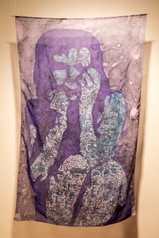
Moving forward I saw Carolina Rodriguez’s piece, “Untitled.” Two pieces of silk showcasing a crouched woman who looks terrified softly wave, hung in the air about one foot from the wall.
Rodriguez’s piece gave an ethereal feel and looks very fragile since the silk is purple but translucent and thin. The piece also has a morbid feel to it, as the woman’s facial expression is slightly concealed by the shadows in the illustration.
Speaking to Rodriguez, she mentions her work is centered around domestic violence. The artist visited women’s shelters which inspired her to use her background in textile design with silk, the delicate material representing women in a place of physical terror. This piece is extremely powerful and stands out from the rest by the soft fabric, and also the terrified body language the woman represents.
Art appears to also include pieces of silk hanging from the ceiling representing the subjugation of the female body in a patriarchal society. Damn good art too.
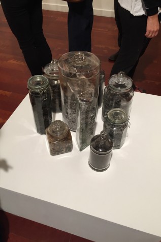
From silk to ashes, Mariela Acuna’s “Untitled” consisted of nine glass jars with the cremated remains of works of classical literature and instructional books.
Books like “Los Miserables,” “The Bluejacket’s Manual” and “A Long Way Gone” were reduced to little black ashes placed inside the clear containers. One could even see the spine of “Frankenstein” against a particular jar.
A quote by the German romantic writer Heinrich Heine comes to mind – “Where they burn books, so too will they in the end burn human beings.”
If there’s one great tool of oppression it is book burning. From Nazi campfires —where books by Jewish authors were met with fire— to ancient Alexandria where Christian texts were lost to ashes, there seems to be a link in society that when the book is burned so is the idea.
Did the artist despise books or was it commentary on how as a society we should take time to read more? Something that made me curious about the piece was that all the jars were closed with clear lids, with the exception of one which contained “The Bluejacket’s Manual,” a handbook for United States Navy personnel.
I attempted to speak to Acuna but she appeared reluctant to talk to the University Press about her art, and mentioned that she only wanted to talk to her friends about it.
Acuna’s work is mysterious and amazing to get lost in. It’s a beautiful take on the idea of content. The ashes make up the same material as the book before it was burned, but it’s clearly not the same. One can’t help but be curious about the process. Imagine an art student burning classic books after school and meticulously placing the ashes and dirty debris in jars, while making sure the spine of “Frankenstein” is visible to the viewers.
Art apparently is destructive, but simultaneously inquisitive and able to move beyond illustrations or projections.
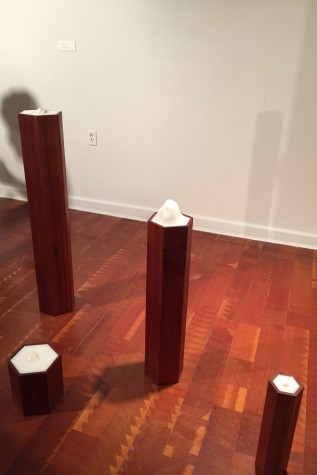
I couldn’t help but wonder about the title for a couple of minutes. Plenty of works seem to be untitled, like nameless orphans left out in the world for the viewer to adopt with their own biases, but not for Haynes. Seeing as the title appears to be coordinates, I googled them and found that 34.6267° N, 84.1936° W were the coordinates for the Chattahoochee National Park. More specifically, the section of the Appalachian trail that ran through it.
Haynes’s work is possibly the most ambiguous piece in the entire exhibit, verging on being annoying. It’s really frustrating and I fell in love with it.
Why five pieces of wood titled after the location of a trail in a national park? The trail runs through more than five states and Google Maps showcases more than five mountain peaks at that location. I found a book by Lon Chenowith titled: “Five Million Steps: Adventure Along the Appalachian Trail.” Is that the significance that might have inspired Haynes? Maybe Haynes despises patrons trying to find meaning in art through the title and the coordinates are nothing more than a goose chase.
If art is about leaving an impression on someone or having the audience think about your work, then Haynes nailed it because I’m still trying to figure out what the hell those coordinates mean.
Next to the enigmatic “34.6267° N, 84.1936° W” was “Embrace” by Diane DeFrancisco. The piece is suspended plexiglass adorned by acrylic paint, with two different women on each side, both meditating in the lotus position. One has her eyes open and her hands on her knees, the other has her eyes closed and arms raised.
The work gives the illusion that the women are with their backs against each other, together in the same plane, as DeFrancisco painted their backs so they would both show when a patron would circle around the piece.

DeFrancisco mentioned that “Embrace” was about “the energy between people,” and that her mother was an inspiration. The piece does carry a sense of maternity and femininity, but it’s not of frailty or gentleness, and more of the feminine comradeship present in the mother-daughter relationships as the figures lean against each other and appear to support the other’s weight.
Art doesn’t have to be obscure. DeFrancisco shows that art can be alluring by the simple, individual expression of an artist’s relationships to their loved ones and how they manipulate material to convey their personal lives.
Farther in the Ritter Gallery was a piece that looked like a giant jack made or mirrors. “#narcissus” by Gabriella Sarraf is a gorgeous, crystallized jack. About three feet tall, the piece was slightly intrusive to people, leaving them to move around it or outright ignore it at times. In other instances, people simply stopped to check their hair, fix their faces or even take selfies with it. It was ironic and hilarious as people made the title come to life by appeasing their own vanity.
As I was admiring the work, I spoke to Sarraf’s mother who, with blushed cheeks and a cup of red wine, passionately praised her daughter’s work and insisted I admire the craftsmanship her daughter put into the piece. I attempted to speak to Gabriella Sarraf, but as we shook hands and I introduced myself as a reporter she scoffed and quickly released my hand. Sarraf asked if I wrote last semester’s article. When I told her I did, she said she wouldn’t speak to the University Press and abruptly left.
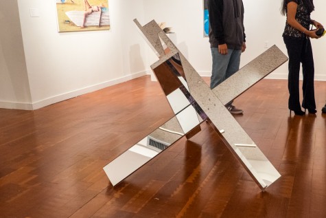
I continued speaking with Mrs. Sarraf who urged me to use the angles of the piece to stare at a small child on the other side of the room. While she proudly described the piece, an elderly woman slightly taller than the work itself walked right into the piece hard enough for one of the acrylic mirrors on the edge to fall off. The elderly woman apologized as Sarraf rushed to place the mirror back to its original location.
I’ve spoken with arrogant, tenured professors that are more polite and well-mannered than Sarraf, and if there’s ever an archetype for the pretentious artist living high in the towers of artistic elitism, then Sarraf truly embodies it. But it may be well-deserved as her work is fucking great. “#narcissus” is interactive, ironic and perfectly titled while also placed in the most appropriate location, it’s arguably one of the best pieces in the show.
“#narcissus” really showcases that art can be interactive and also separated from the artist.
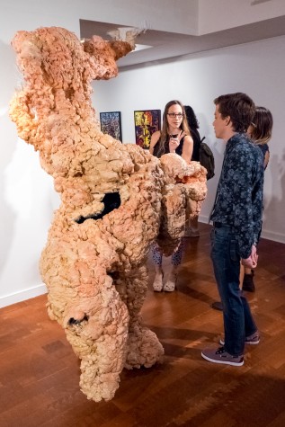
Farther in the exhibit, there is a large, monstrous piece of flesh and eyes reaching up to the ceiling with some parts attaching to the wall like a parasite. “Faux Pas” by Chelsea Rose Hustad consists of insulating foam, make up and doll eyes.
It’s the ugliest piece in the exhibit, but also nothing less than incredible. “Faux Pas” was constantly being stared at in disgust and patrons pointed and took pictures, appearing grossed out by it. While I was inspecting it, a small child kept continuously touching it and smiling into the black void in the middle of the piece.
While “Faux Pas” is almost offensive to the eye, Hustad is an unassuming woman with an endearing demeanor and welcoming smile. She, who appeared small against the grandess of her work, mentioned that I was the third person to ask if she was inspired by the 1988 anime “Akira.”
Instead, the work was based on a skin disease she suffers from when she’s nervous. “Faux Pas” looks disgusting – something which Hustad is more than aware of. “I like making gross art,” Hustad told me smiling.
“Faux Pas” brings about an aesthetic experience not from beauty or familiarity, but out of stomach-churning imagery and the revolting texture of the material. Hustad is the bravest artist in the exhibit; defining herself as an anti-formalist, she shows that art can stray away from the classical western standards of admiring glamorous forms and instead appears to want her audience to be nauseated.
Art can definitely be ugly and gross.
“Daydreaming” by Kim Diaz might be the materialization of the question, “What is art?” Placed on a stand is an iMac screen showing a perfectly looped GIF of a misty forest from the point of view of a train goer passing by. The GIF itself isn’t on the iMac, but rather a zip drive attached to the monitor.
“Daydreaming” is a curious piece, much like “X.” Where does the “art” reside? In the zip drive? The iMac? If a photographer from the University Press was to make a GIF out of the GIF and display it in an article, would anything be lost in the process? Would it still be art?

The process for making “Daydreaming” seems pretty simple. The artist possibly went on a trip up north and chose to take some footage, slap it on a zip drive, reformat it into a GIF and voilá – it’s art.
The installation almost smells like Duchamp’s “Fountain,” but on an even more modern level, dealing with the advent of digital media and how it’s transcending into the artworld, this piece of art appears to focus not on being art but in asking the audience what art is. I love it. One might not even have to buy “Daydreaming,” but instead ask Diaz if you can download it from the zip drive and keep some art in your own computer or phone.
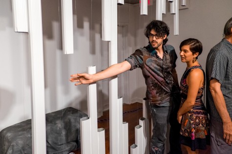
On the far end of Ritter’s Art Gallery is “Untitled” by Chad Perna. This installation consists of aluminum gutters placed vertically from the roof to the floor. The gutters are cut in the middle and with red and blue wires in place. The installation isn’t pretty and it’s almost awkward to interact with the clunky display. Art galleries aren’t the usual place where societal norms encourage people to manhandle what’s on display. Plenty of patrons even seemed scared to touch live wires. I was one of those cowardly patrons, but once I grabbed a wire the installation made more sense.
Hold a wire and you hear a thunderstorm, another and you get rain, another and you have a single droplet of water. Perna’s work is based on the relationship between Florida and the weather. Living in the suburbs, Perna was inspired to use the aluminium gutters that were all too present in his childhood – hurricane season and storms and rain, gutters were there.
Mohammed F Emran | Staff Photographer
It should be noted that the sounds are just short of divine. The wire that triggers the single water droplet is incredible and worth the visit to the gallery alone.
Besides visuals and textures and individual interpretations, Perna’s work stands on its own in the most creative and universal way – sound. It’s honestly outstanding how far the limits of art can be pushed by having wires running down gutters and listening to the crisp chime of a single water droplet, or a thunderstorm audio bit which at times made people look up as if the source was coming from the sky and not the speakers in front of them.
Art is cool but, I don’t think I know what it is. It’s gross and it sounds nice. It’s also transparent and maternal, and the people that make it can sometimes be pretentious. And it can also involve burning literature and GIFs.
If I figure out, I’ll let you know.


